

Spicy green book

Spicy Green Book is a virtual directory for Black-owned food and beverage businesses throughout the US and Canada. Their mission is to empower Black-owned food and drink businesses to compete and thrive in the marketplace. By providing professional creative services free of charge through a legion of passionate volunteers, we get these businesses online and in front of customers. In doing so, we are building substantive relationships and social trust within communities and creating a more equitable society.
The first task I was given was to audit the mobile website. My first step was to find some participants to interact with the app. I reached out to twenty individuals who were a mix of UX Designers and regular individuals. Fifteen people got back to me and after talking with everyone, I was able to create my Affinity Map which helped me deduce the three largest overacting pain points with the Mobile Site as well as a few others that I felt needed to be mentioned.
The first three pain points are issues that at least ten or more participants commented on. I feel these are all major pain points and things that need to be changed to have a more pleasurable user experience. Under Miscellaneous, I added the other issues that I felt needed to be addressed. More than five participants commented on these, but it was less than ten. I feel like all of things should be changed but these are not as pressing an issue as the major pain points.
Paint Point 1
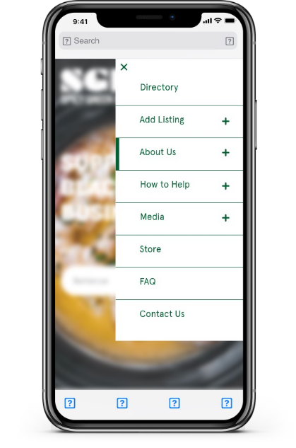
The first and biggest issue was the Menu. All fifteen people that responded to my inquiry had some issue with it. The three words that came up the most were overwhelming, cluttered, and redundant.
Redundant and Cluttered.
My first step was to combine some of the pages. Anything with a + sign meant that there is going to be a dropdown and subpages. As in the example, the About Us, I put everything that I felt fell under that category into a dropdown. The combined categories are:
Media - Press, Testimonials (this had also been misspelled on the menu bar.)
About Us: - Our History, The Team, Volunteers, Updates
How to Help - Donate, Sponsor, Volunteer
Combining all of these categories meant that when the User opens the Menu Bar, instead of seeing 14 tabs that take up your whole screen, they are now only seeing the 8 tabs with the ability to see more as they please.
Overwhelming.
My second step was to try and tackle the other reason the menu felt so overwhelming. I felt that the two biggest reasons for this was that Menu took up the whole screen as well as the color of the menu. I made the menu white, which is a less harsh and hard color than the green in this case and then I changed the wording and + - to green. I also added a marker so that the user knows whenever they are hovering over a certain tab.
I then halved the menu. All the users said they felt stressed looking at it as a full page. Adding the half page lets the user see everything they need to see while still seeing the home page, so the user doesn’t feel lost or disoriented.
Below are the changes that I have suggested.


What SGB mobile originally looked like.
Spicy Green Book’s Current Mobile Website.


Pain Point 2
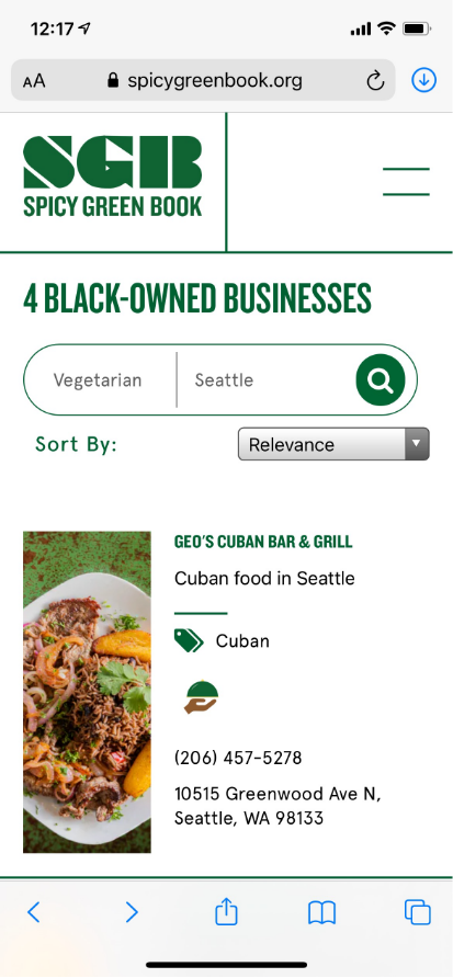
The second biggest pain point for users was the way the results page looked as well as the things listed when quickly glancing at a result.
What SGB originally looked like
My suggestions and edits.

Many users felt that the logo was too big and that it took away from seeing as many results as possible on the screen before scrolling. I don’t know if we are able to make the logo smaller without distorting it, but I did make that area smaller in the new display.
Many were confused on why the search results came up above the Search box. Many reported that they didn’t realize that it was there at all. I put it below the search box as well as added an “All Results”.
When just glancing at the results, many users mentioned that there was no price amount, no hours, and no way to see how far away from you the results were. On the updated page I added in $$$ as well as hours of operation. I also added the option for the user to use the list results as given or to see the results on the map.
Adding in more tags so the user could find these places under many other options.
Spicy Green Book’s Current Mobile Website.

Pain Point 3
The last pain point that was a through point for most users was the inability to realize when their search had produced no results. Many were frustrated with the Subscribe box being so high up as they thought the results might be underneath it somehow.
I took the same strategy with the second pain point and just added a few things when there were no return results. I moved the results to below the Search Bar as well as added an “All Results” marker. This helps the user instantly see that nothing has come up.
Adding a note/description as well that there were no results in your area and then suggesting that they sign up below is an easy way for the user to recognize exactly they need to do to be notified of when there are results in the area.
What SGB originally looked like.
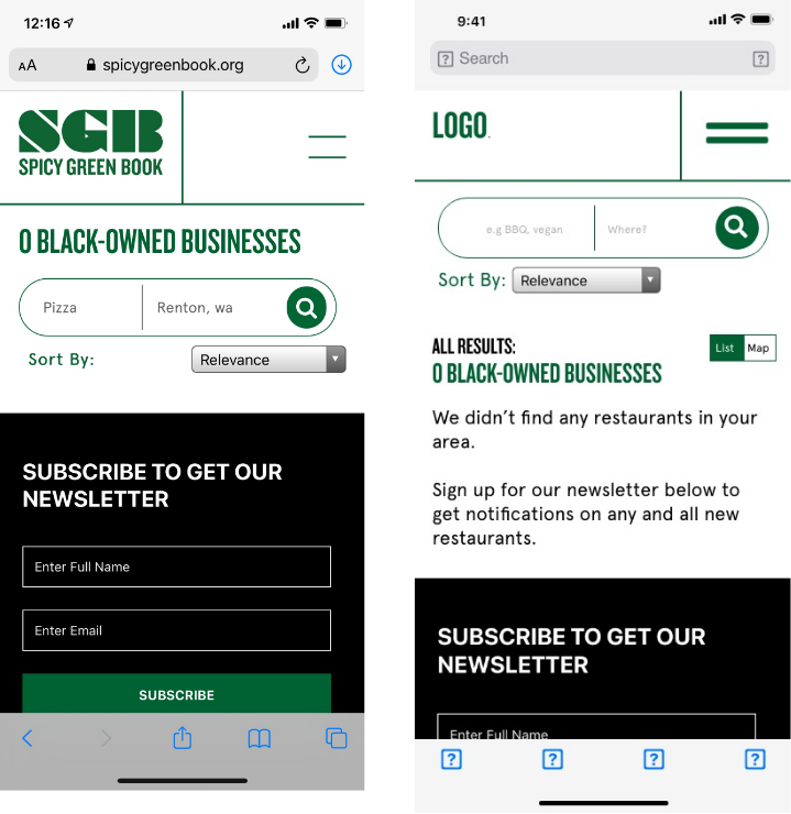
My suggested edits.
Spicy Green Book’s Current Mobile Website.

Pain Point 4
I wanted to include some issues mentioned that were mentioned by more than 5 user but less than 10. These were frustrating moments for the user, but I think these are minor pain points that can be easily changed.

1.
Slowing down the pace of the testimonials on the home page. Many users were unable to even finish reading one before it had switched to the next one. There was also no discernible way to keep the testimonial still to finish reading.

2.
When scrolling down to the bottom of the Home Page, there are two Subscribe to Get Our Newsletter options. The first one on the left, a quote, and then the one on the right. Many users felt that this was redundant, especially as they were stacked right next to each other.

3.
On the Contact page, the contact form is now the same width as the rest of the page. Many users felt frustrated that they had to scroll left and right to fill out and read the form.
Learning to do a Mobile Site Audit was something that I found invaluable and I am so grateful that Spicy Green Book allowed me to volunteer and then went forth with so many of the ideas that I had suggested. I will be forever grateful that I was able to do this, especially for a company that is doing something that I truly believe in and try to do in my own person life as well.