
All your airlines, in one place.
A Passion Project.
Traveling is a passion of mine. Downloading a hundred different apps to get all of my airline tickets in one place is not. When I worked at Alaska Airlines, one of the biggest complaints I received was that passengers were missing flights and were just generally confused on where to go because they did not know what airline they we’re flying, where to check in, what app to download, etc. Jont is here to solve all those problems.
My goal? Jont is an app that lets the User see all their airline travel information in one place. Understanding the User’s struggle when flying multiple airlines; be it conformation codes, where to check in, what airline to report at at the airport, or any other issue that may arise when flying multiple airlines. Simplifying those problems within one app to create a better travel experience for our user.
Empathize
RESEARCH PLAN AND GOAL
Before getting started, I wanted to create a research plan to help me keep my goals in mind at all times as well as to keep me on the right track at all times. Some of the questions I always wanted to keep in mind were:
What are users motivations and pain points when dealing with multiple airlines.
Does knowing that a trip will consist of multiple airlines influences their decision in any way?
What features would they expect to see when using an app that had every airline in one.
My next step was to conduct some surveys to better understand the users needs and to gather some information about the users likes and dislikes when dealing with multiple airlines, checking in online, and their likelihood of using Jont. I had no target audience in mind as I want everyone, no matter how comfortable they are with travel or apps, to feel at home and at ease using Jont and so I was able to collect results from 30 participants.
The key finds were:
All participant felt more comfortable using an app vs talking to someone at the airport.
50% of all participants have felt lost when trying to understand how flying on multiple airlines work.
50% of all participants have gone to the wrong location at the airport. Having purchased a ticket on one airline, they assumed that is who they would be flying while in reality, it was a different airline.
30% of participants have called an airline representative for some reason regarding their confusion surrounding a reservation.
75% of participants have stressed about either ending up at the wrong airline, not having the right confirmation code, or some conbination of the two.
DEFINE
USER PERSONA’S
Based on the feedback and insights that I gained from the survey’s, I was able to create two different persona’s that I felt might use Jont. Creating these persona’s helped me put down key user goals and frustrations that needed to be addressed in my app.


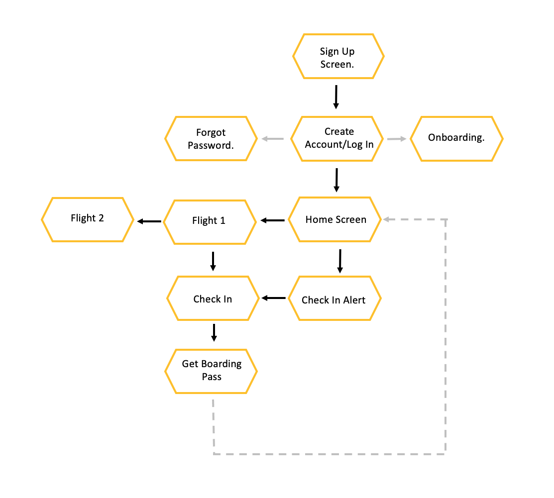
USER FLOWS
Before I started sketching and building out my wireframes, I wanted to create some User Flows that would help demonstrate what it would look like when a user was trying to accomplish a specific task. I choose three different tasks to highlight what I thought the most important features of the app should be.
Adding a new flight to the app.

Finding the confirmation codes, which airline you are flying, etc.
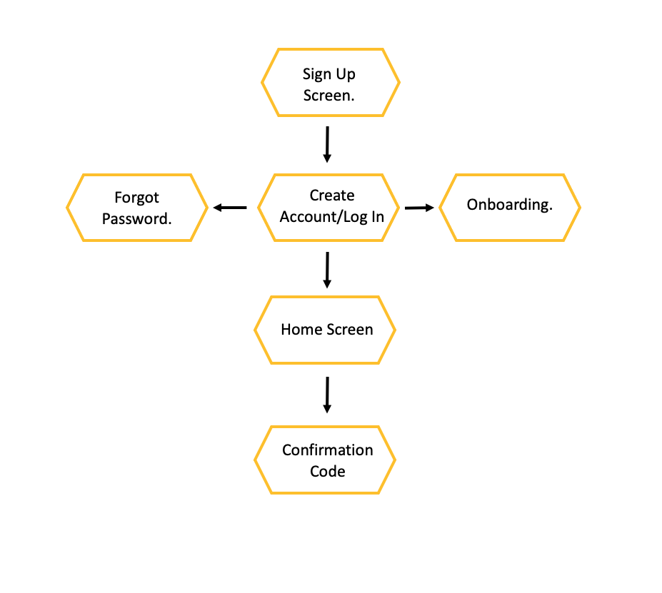
Responding to a Check In Alet.
IDEATE, PROTOTYPE, AND TEST
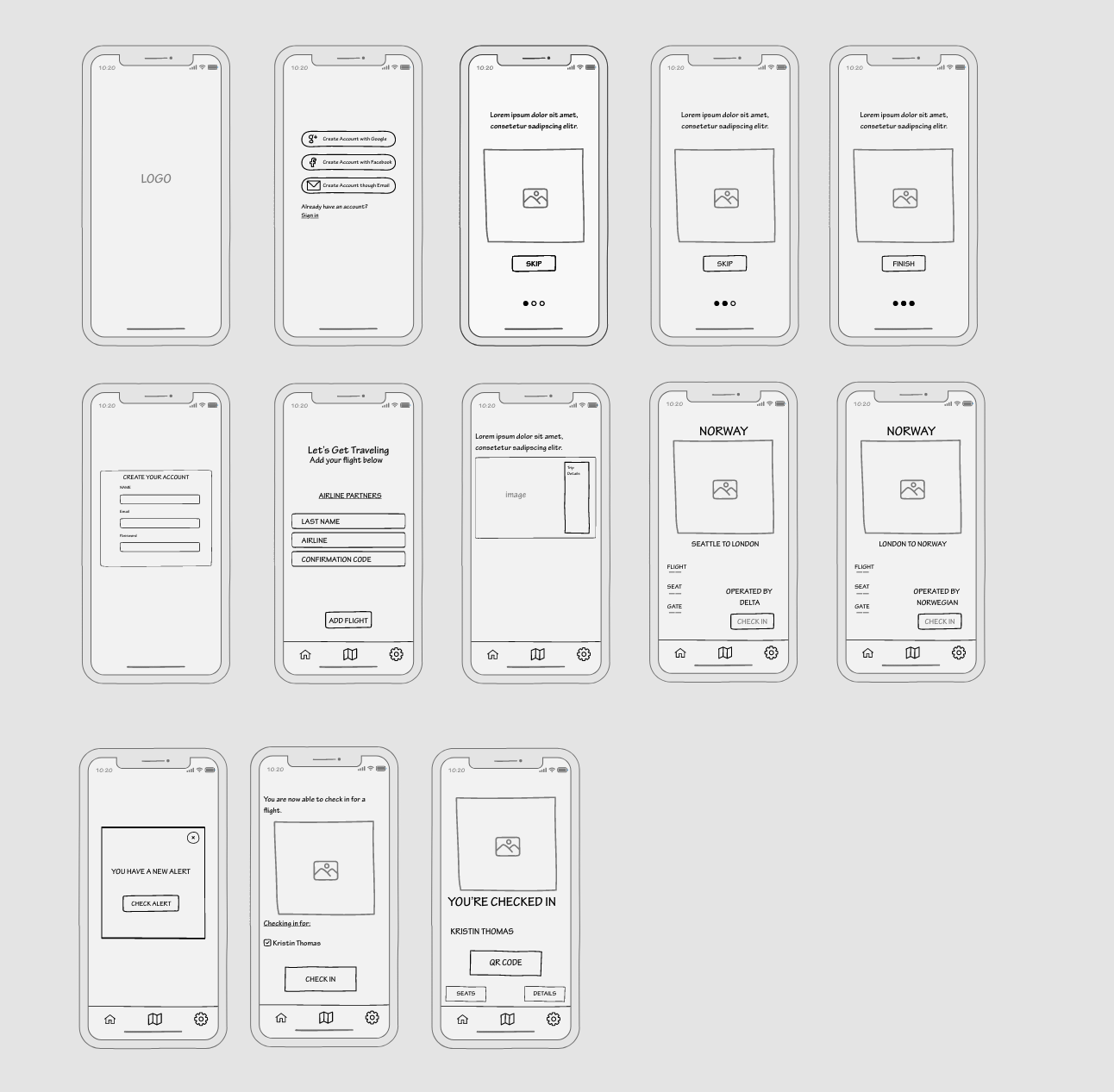
SKETCHES
The next step after the user flows was to create some low-fidetly wireframes, starting with the Splash Screen and then taking the User through every step of the app. Creating these wireframes I wanted to be sure I kept the needs from my User Persona’s in mind. Keeping these at the forefront of my mind helped me to solidify some of my ideas.

WIRE-FRAMING AND PROTOTYPING
After sketching out what I felt were the most important features of the app, I went ahead and moved on to my mid-fidelity wireframes.
While building these prototypes I wanted to make sure that I was making time for usability testing, before I incorporated any UI elements or moved into a high-fidelity stage.
I decided to conduct another round of testing to see if any issues would arise and make sure that they would be corrected before I moved on to my next stage.
My goal for testing:
- See if the participants were able to understand what airline they were flying and who to check in with.
- if participants were able to easily view a booked trip
- how satisfied participants are with the app
- does the user understand the functionality of the app and all its features
I was able to sit down with four different user’s, all with different comfort levels when it came to flying but all very comfortable with apps, and was able to conduct in person testing.
Key Findings.
All user’s enjoyed how simple the app was.
”I don’t need this app to give me the world, I just want it to hold my tickets and tell me where to go and it does exactly that”.Three of the four users pointed out that no where in these frames did I put a place, or as of this moment they didn’t see a place for confirmation codes, and as that was one of the main selling points it should be more prominent.
”The confirmation codes should be somewhere on the main page. Nothing is more irksome than trying to log on to British Airways and then realizing I only have a Delta confirmation code and I have no idea what the British Airways confirmation code is. So, yeah, front and center would be ideal.”All users suggested moving the onboarding to after the the slide where a user creates an account. They felt it was a little disjointed and choppy.
After taking all the critiques from the first round of User Testing, I was able to apply what I had learned to my mid-fidelity wireframes. Once I felt confident enough to move on, my next step was to do a quick Preference Test. I had been struggling since the beginning to think of what the Splash Page should be. I knew it should have to do with an airplane but with so many beautiful options on Unsplash, I was at a but if a loss. So after a bit of testing, I ending with these as my final two and luckily, there was one clear winner. With 10 participants in my Preference Test, 8 of them choose Option 1 on the left.


Taking my semi-polish high-fidelity wireframes with my new Splash Screen, I decided to do one more round of testing to gain even more feedback that could help me further refine my design.
HIGH-FIDELITY WIREFRAME AND CLICKABLE PROTOTYPE

When it comes to the future of Jont, I plan to keep the same hypothesis in mind. While I think I accomplished what I had in mind, I think there is always room for improvement.
Conducting more User Testing will remain a top priority. After my first round of testing, everyone I interacted with was very familiar with apps and travel and while I think they would enjoy and find this useful, I would want to test this on user with a little experience in either area. Depending on the results on extended testing, I might expand my functionalities. They are very limited right now but as one user said, “I don’t need this app to give me the world, I just want it to hold my tickets and tell me where to go and it does exactly that”, so while I am always open to improvement, keeping the main function and simplicity of the app will remain a forefront.
All images used in Jont are from Unsplash and all icons and illustrations are from Icons8.