INKHAÜS. A ONE OF A KIND TATTOO APP.

InkHaüs was a Case Study, originally name Ink Tank, that I choose and then created throughout my UX/UI Design certification course in CareerFoundry.
InkHaüs, wanted me to create a way to share tattoo images while connecting tattoo artists and enthusiasts. First I created a problem statement.
Our user needs a way to find inspiration, find an artist, and get a tattoo all within the comfort of their own homes, helping them feel safe in the knowledge that when they finally do decide to get that tattoo, there will be no regrets.
As an artist, our user needs a way to connect with customers in a simple and intuitive way with the knowledge that they are being given the best service possible while also being able to promote their work.
The Solution? Creating an app that lets users peruse many different artist’s work, no matter where they are located, giving the user the ability to contact artists so that they can collaborate, and give the user basic tattoo information and guidelines in a simple and easy way that lets the user make an educated decision in all facets of the tattoo process.
My Role: UX/UI Designer (Research, Interactive Design, Visual)
Tools: UsabilityHub, OptimalWorkshop, Photoshop, AdobeXD
Timeline: March-Dec 2020
USER RESEARCH
To better understand our users, I conducted online and in person interviews. I interviewed four people who had a varied amount of tattoos, as well as a varied interest in tattoos. Since this is an app that is designed not just for users, but for artists and shop owners as well, I went ahead and interviewed a tattoo artist so that I could get a full range of information and perspective.
After interviewing all the participants, I created an Affinity Map. With the Affinity Map, I was able to deduce some of the most important issues.

Let’s Break it Down.
Flash Tattoo’s.
Flash tattoos are something that 4 out of the 5 people that I interviewed were interested in. Figuring out a way to advertise those during Halloween and other special occasions would be a great way to promote a shop or tattoo artist.
Fears.
Most of the people interviewed didn’t have too many fears regarding tattoos. One was still annoyed that he felt such pain and another worried about infection.
Media.
All participants used social media or google to either follow artists that they enjoyed, friends that were artists, or to gather different photos from different area’s for inspiration. Making sure the app is photo heavy and user friendly will help keep us in the game.
Safety.
Everyone felt that shop standards were very important. Cleanliness, especially in the time of Covid, is a number one priority. Making sure users can see a shops rating and all their reviews will help keep customers secure in the knowledge that they are going to a reputable shop.
Collaboration.
All participants felt that collaboration was important. Making sure communication between users and artists is a top priority will keep all users happy and faithful to the app..
Share it.
Being able to see/upload an artist’s portfolio, articles on tattoo maintenance and other healthcare tips, being able to save your own designs, articles on the culture, and ease of use are all things that participants are looking for.
Frustrations.
All participants had a good list of problems and frustrations. Many were frustrated with either the price of a tattoo or the availability of a shop or artist. Others didn’t like having to go between multiple apps to get everything done when searching for tattoos. Creating an app that does everything all in one will alleviate the issues and frustrations that many users faced. For the artist, on the other side, making sure that their frustrations are met as well. Keeping the application simple and intuitive so they do not have to worry about mistakes or accidentally ignoring clients.

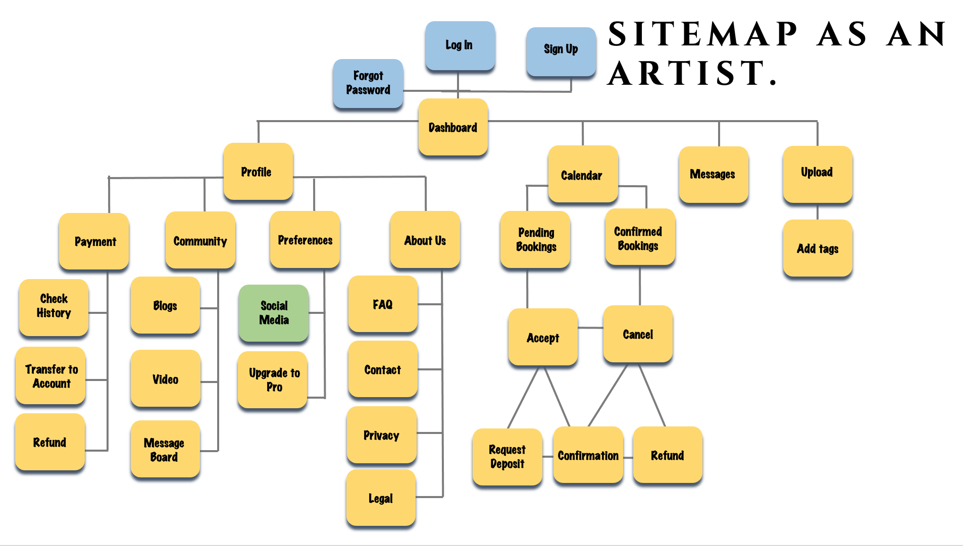
USER PERSONAS, FLOWS, AND SITEMAP.

After conducting my interviews and research, I was able to create three different persona’s that defined my varied target audience. The first persona was Kala, someone who has always been interested in tattoos but has never gotten one for some reason or another. My second persona was Moses. He has many tattoos, has a specific interest and style, and is always interested in getting more tattoo’s. Finally, I created my third persona whose name was Sam. Sam is a tattoo artist who is not attached to any tattoo shop. She travels frequently and needs to be able to update her location so that she could continue to tattoo no matter where she is currently located.
After creating my User Persona’s, I created three User Flows. Creating user flows with certain goals in mind for each persona helped me to identify different emotional stages that a user can go through when trying to reach and complete goals. This helped me to identify different areas to improve quickly and efficiently.


WIREFRAMING AND PROTO-TYPES
I began my wire-framing by sketching out the different navigations needed for three basic features of the app. Sketching out my features created low-fidelity wireframes that gave me an idea of where I wanted to go as well as let me begin in the first of many rounds of user feedback. After creating the basic layout with low-fidelity, I moved on to a clickable mid-fidelity layout. After getting feedback on these three features of my app, I went ahead and moved on to creating a high-fidelity version. I cleaned up the design using the Visual Design Principles and I made sure that the balance, hierarchy, unity, and contrast were something that met the principles that had been laid out for me. Then I created a Grid Layout. I decided to go with a 12-column grid with a gutter width of 10, column width of 19, and a margin width of 15. Keeping in adherence with the Material Design Guidelines and the Emotional Design, I tried to elevate the design with color, personality, consistency, and intuitiveness. Finally, I took these polished high-fidelity slides to my peers to be provided further feedback.


USABILITY TESTING
After completing my mid-fidelity clickable prototype, I interviewed six different participants using moderated remote usability tests. I asked the participants to complete four different tasks in order to assess how each of these users, who were new to the app, interacted with and completed said tasks. This would help me discover any issues that were lurking in the app that I had not yet discovered.

Top 5 Issues
Testers did not know how to complete a regular search. Solution? I created three panels that let users click through the “search” functions.
Testers did not know when they had chosen a Date and Time for an Appointment. Solution? I decided to create a whole page for the Available Time as I was unable to make the images do what I initially wanted them to do. No Testers struggled after this.
Tester’s were interested in a Tipping option. Solution? I struggled in where I wanted to add in a tipping option as I did not want Users to say they would tip later and never tip or to force Users to tip beforehand without ever seeing the completed work or customer service. So I decided to turn the deposit that Users would pay for into an option to tip. Safe for everyone.
Giving a clickable number rating next to an Artist’s profile. Solution? I added in a number rating next to the stars as well as made the stars clickable, taking Testers to the reviews for Mr. Bo.
Change the wording on an Artists’ pictures. Solution? I changed the verbiage so that Users could see what the Artist had uploaded themselves versus photos that they had been tagged in.
THE FUTURE

When it comes to the future of this project and this app, I plan to keep the same hypotheses in mind because I don’t think I have fully and completely solved the problem that I originally created. I will conduct more user testing as I have done a lot of work on my current prototype that many people who fall in my target audience still haven’t seen. I will also expand my prototype functionalities, because as of right now, they are very limited. Adding in my prototype the ability to upload a photo, search for an artist using a location map, and fleshing out more of the business side of the prototype would all be incredibly useful in helping new users get an even bigger feel of what the app will look and feel like when they are using it. After adding more functions, more testing would then be required, just to make sure that the new functions added don’t have any issues.